Pages

24 May, 2013

Stop Looking At Me Swan...

Using the guest bath used to be only for the bold and brave.  Because of this big beautiful old window RIGHT NEXT TO the hot seat, doing your dirty work meant a little over sharing with anyone in our backyard. :) 


But thanks to a roll of window frosting film, picked up at Lowes, we got it covered now! :) Guests can do their business incognito. Haha. As it should be! 


This stuff is pretty simple to use and does a really nice job.  It doesn't take an expert to get good results and there's practically nothing to it supplies-wise.  You don't need fancy squeegees or window spray to apply a film like this.  All the same goes for window tinting too.  All you need is: 

1.) A plastic/credit card
2.) A soft, thin rag - like an old t-shirt 
3.) A spray bottle
4.) A drop of mild liquid soap - like baby shampoo or dish soap
5.) VERY SHARP exacto knife - a dull one will rip your film
6.) Window Film

Here's the frosting film we used. It's from Lowes and probably cost somewhere around $20.00 and there's a TON. You can do a few windows with this, I'm guessing. 

To start, you clean your window really well. DON'T USE A RAG THAT LEAVES FIBERS ON THE WINDOW.  Towels are the worst for that.  The fibers, dirt, etc will create lifted pockets under your film so your window wont look like good quality.  

Step 2 is to mix your drop of soap in with warm water in a spray bottle.  Then, prepare your "squeegee" by wrapping your old t-shirt rag around a credit card.  The rag helps keep the cards sharper edges from tearing the film and the flexibility of the card means you can easily press it up onto the window tint and squeeze out your adhering liquid.  

Step 3: Next, there are two different methods for cutting your film to size.  It just depends on your personal preference.  One is to cut your film to be roughly the size of the window you will be covering, maybe slightly larger on each side and then use the "squeegee" (read - c.card wrapped in a t-shirt) to press the film up to the edge of the window and trim off the excess.  Method #2 is to measure your window and cut the film pretty much exactly to size before applying it to the window.  Trim as necessary.  

Step 4: Spray your window with your soap/water mixture. SPRAY LIBERALLY.  Remove the backing from your film and place your film onto the window.  As long as the liquid is on the window you will be able to slide the film around into place easily.

Step 5: Once with film is pretty much where you want it, begin squeegeeing the water out from the center of the film towards the edges.  This allows the film to adhere to the window.  

Step 6: Trim excess film as necessary by carefully using the exacto knife to get as close to the window frame as possible.  Here you can see that we have VERY OLD WINDOWS with lots of uneven paint edges.  We just worked patiently to cut as close to uneven paint as possible. 


 Our window had 6 panes of glass, which meant we cut six pieces of film, instead of one large one.  On one of our panes of glass we even had a crack. Like I said about fibers causing puffy pockets under your film, a crack will do the same. So we very carefully took our exacto and cut along the crack.  This meant both parts of the window film would lay flat up to the crack. 


 Here's our crack a little more up close and personal. :) haha. 


So, if that was a confusing explanation then allow me to introduce you to the amazing John & Sherry Petersik  of Young House Love.  In this post you see photos of how they filmed their window.  And here's a great how to video play by play for window frosting. :) Happy weekend! 


1/2 Bath Revival

One of the first renovation projects in our new house was the 1/2 bath because it was the smallest space in the house.  I knew every room was destined for repainting but I started here because I was so excited to revive this dead space and start making this house feel like our own! 

It's an adorable room.  Totally charming...and  I realize that's a strange thing to say about a bathroom.  But when you open the door, the first thing you notice is how insanely TALLLLLL the ceilings are. They're GORGEOUS.  Then there's the oversize old window = so old it's worn, worn, worn, but still, it's sweetly bright and cheerful ...like an adorable old man you just want to hug. Call me crazy. :)  

  Then there's the sink. We affectionately named Big Bertha.  She's all huge and clunky and probably just as old as Mr. Fenster (that's Mr. Window to you.)  You can tell she wanted to be equally as charming as the old window and tall ceilings but she's, um, how do I say it kindly? Well, not. :(  She was probably an original. I'm just guessing here.  For that reason I'd been torn about giving her the boot.  Except she reminded me of an old gym class drinking fountain with her crusty gams down below and rusted old slits in her porcelain finish.  You can see my dilemma.  I think the previous owners even tried to spify her up a bit by giving her new sparkly hardware, but it just didn't do the trick.  In all of her awkwardness, the prettier features of the room were hardly noticeable: the updated and much nicer light fixture, aged but still perky glass shelf, super tall ceilings, and huge window.  Sorry Big Bertha, you did well but it was your time old girl.  And I'd already found a younger girl to take your place.  She was only 60 beans at Lowes.   


Here she is in all her rusty, ring-around-the-drain-hole glory. :) Ps. Take note of her legs. All 3 of 'em.


- WARNING - 
Toilet shot coming up next.  
Don't mind the off center canvas and strangely placed fake flowers in our spare TP canister.  Those were parts to a *Pinterest* project I had imagined would end up in here...but so far it's still a no go.  

On top of my BB problems were the brown and cream colors that just weren't doing anything for the space.   
See how they're not making each other look like much? Picture dead flowers. Dried, hung upside down, faded from the years and full of dust. No energy or spunk.  That mental image is what this bathroom's colors made me feel like.  Not to mention the incredibly interesting linoleum flooring that was made dingier by the too-yellowy cream wall color.  


 It took me all of .25 seconds to decide after seeing this bathroom that I wanted to paint it something HAPPY! 
  So armed with a 2 quarts of paint and an uber determined energy for transforming the space, I dove right  in.  I'd been to Home Depot and fallen in love with the earthy and cheerful colors of Martha Stewart line and since dusty teals are totally my fav, I grabbed a quart of a color called Rainwater for the upper half of the walls and Popcorn for the bottom half.  See how the color is a soft, Tiffany Box blue that really feels warm and lively but not to in-yo-face energized? :)  Let the ooo's and ahhh's commence!  I personally think it's a much better color for the space. It opens the room up, brightens it, raises the roof (woot, woot)! 


Prior to painting, I Spackled and sanded two spots on the ceiling that were cracked and uneven.  


It took me less than one hour to cut in and get the first coat up after which I stood back to admire my handiwork and was so pleased with the outcome that my giddy-meter went off the charts = ridiculousness.   Picture me thrusting my paintbrush towards the ceiling and shouting, "it's alive!!!!! Mwa-ha-ha!" And then dancing like King Julien :)  haha!


Because this is what painting can do! :)  

(Ok, no, the paintbrush didn't magically turn Big Bertha into a more sophisticated and sparkly version of a pedestal sink.  That was ah-la my husband on another long weekend. :)  


But can you see the magic in my wand?! Er...paint brush? 

Don't mind the art hung on the walls. It's hanging on old nails because I was too impatient to remove and spackle over those so I painted over them. :) Cheese :)  Yes, I made time to spackle the ceiling but not the art holes. :) haha. MUST HAVE NEW COLOR MORE!


Even the scary linoleum looks slightly perkier now that I painted the cream colored faux-tile surround. The original plan was to replace that faux-tile with board & batten but for the time being, other rooms needing painting takes priority over demoing cheesy wall applique. 

02 April, 2013

Home Sweet Home

I'm so charmed every time I pull up to my house.  Especially in the midst of a sunny day with birds chirping and all the delights of spring making me swoon. :)  


This is the start of month 5 living here but I still sometimes can't believe we own a house.  Friends told me that it was so much better than renting because it's yours but I didn't entirely get that until I started living here.  The freedom to renovate what we want is awesome! And there aren't any noisy neighbors that we can hear through the walls at 3am. :) 

I am super excited to see all the flowers and plants that grow in our yard this year.  We are brand new to lawn/yard maintenance so learning to care for it all will be a whole new adventure when things start popping up all over the place.  I'm sure we were supposed to cut those dead plants back that are in the bed lining the driveway but here's hoping it's still ok in spring!  

For now, I'm super happy to have those BOXWOODS (look how awesome I am-I know a plant name!!!!!) that never turned brown.  Some kind of greenery in winter is always nicer than the dead grayness most plants turn into.  Plus they were the perfect source of entertainment for the kittens since they housed tons of tiny birds that the cats could watch from the windows. :) It's been a happy home so far. Hooray!


01 April, 2012

Gallery Wall of Adventures


Shortly after we moved in here Dan and I started chatting about how we had so much wall space that was begging for photos of the many adventures and travels we've shared together. Originally we came up with the idea of a mosaic photo blown up extra large on canvas which would showcase so many pictures from our trips. But, it didnt take long to realize that we were hmmm-ing and haaaa-ing over it too much. Not too long after that we were inspired by John & Sherry's gallery hallway and realized that was exactly what we wanted to do with this large open wall in our dinning/kitchen area.

Younghouselove.com

Here's a shot of the kitchen right before we moved in from when were scoping out the place...
And this is about a week after we moved in. In our last apartment this dresser lived in our kitchen (which totally felt appropriate) and acted as a buffet; however, here it seemed a little small and out of place.

So after I had spent some time collecting cheapo frames from the Salvation Army and sanding and repainting them all to be white I cut out shapes the size of each frame (just traced them on the paper) and taped them on the wall. I can't say why I started out in the left corner...perhaps at the time I still thought I had enough frames to cover a large part of the wall...then I realized I would need about 6x as many to cover even the top half of this wall. Oh, and we picked white frames because I did enjoy the way the white gave some unity to the variety of pictures/art/maps/etc on John and Sherry's wall. I love metals, different shapes, thicknesses and the like on frames but I knew I, too, was going to hanging up an eclectic array of travel related memorabilia.

OK, so I dont seem to have an "in between" shot of when I actually rearranged the templates into this format but nonetheless, here it is with art. I think my "plan of attack" was to start with a heavy looking frame/art in the middle to anchor it and then work out. I knew this looked top heavy but I didnt care because at the same time I wasn't contented with having so few frames so I figured I'd end up adding to the wall relatively soon....and so I did. :) Oh, and initially I didnt know what art I was going to hang so I clipped a bunch of colorful shots out of magazines. Dan was so disappointed that I got rid of the clipping of 3 long tailed monkeys goofing around with each other. :)

I ended up finding a whole bunch of white frames at Hobby Lobby for 40% (or more) off the already cheap sticker price and snagged a bunch for just $36.00. I will say I enjoyed them much more than my slightly cheaper bunch ($20.00) of frames from the Salvation Army because the backings were easy to remove and replace so changing my art would be easier over LOTS of years. The ones from the SA were usually finished with staples and those are hard to bend and flex multiple times if you want to change out the art. Just a tip. So here she is after I did more templating and hung up the remainders. Speaking of which, I guess I should explain the template thing. John and Sherry shared this great secret to accurate nail holes for each frame and I just repeated it. Basically, I cut the paper the size of the frame, turn the frame face-down and put paper lying on top. Then I'd take a pencil and punch a whole in the paper where the groove/teeth were that would hang on the nail in the wall. That way after I taped my template to the wall I had a perfectly centered hole to punch a nail through that would allow my frame to hang beautifully.
Some of my favorite pieces up there were these random art projects I put together. The big dipper has special meaning to Dan and I so I found this cute canvas rendition on Pinterest and had a grand ol' time painting and punching pins through the canvas to create something unique and special for us.
This is also a SUPER COOL piece for us! We found these Megaladon/GreatWhite Shark teeth on the beach (not more than 25 feet apart!) on our trip in North Carolina so I thought it would be a fun reminder of that vacation. The frame itself was a shadowbox from IKEA and I used canvas paper behind the teeth to glue them down to and to make it look like they were in sand. It looks so cool with the tan canvas. Very fun way to remember looking down by our feet on that sandy beach and saying, "OMG, look at this shark tooth!" :) And Yes, they are as huge as they look! The one on the left is about 2 inches long, at least!


Belated Christmas Wreath Post

This past year I reused my wreath base from Daniel's birthday wreath to add a little Christmas sparkle to our front door. :) I had a friend over for the night making crafts (she painted while I "wreathed"??) We had a lot of fun collecting our materials since she acted as my lookout while I stealthily chopped down a branch from one of the apartment pine trees! I then dragged it all inside (kept it in a big paper bag so it didnt get sap all over my floor) and proceeded to cut it up and wire it to the wreath base. Just added a few green bulbs in matte, sparkle, and shiny from Michael's (on sale, of course!) and...hooooray for holiday cheer!!!


Recycled Springtime/Easter Wreath

With the flowers blooming everywhere I am totally feeling like having more green and color around our house. I got pretty excited about wanting to be outdoors and so I put all of our plants out on our porch, opened all the windows, and decided to bust out my own blooms. :)

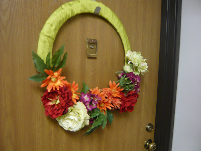
Since our front door's been barren since Christmas when we had the homemade Christmas wreath hanging on it, I figured it was the perfect place for a cheery bit of change! So, I collected all my random faux flowers (from my seasonal storage box), my wreath base, and some recycled cloth ribbon....annnnnnnnd wha-la! My 10 minute, colorful, happy wreath!


01 December, 2011

Stick Star


This is a project inspired by Katie Bower's Barn Star. I've admired it for a while and have been searching for appropriate stick-age for MONTHS with no luck... until just two days ago. I FINALLY found these mostly straight, curly willow branches at JoAnn's and since I wasnt interested in cutting down so many twigs from outside to make my star, I caved to the $9.99 price tag (ridiculous for something that I can find out my back door for free but eh, I'm occasionally lazy. Tuesday was that kind of day.)
I was loving the accompanying jute that went with the twigs. Just what I needed!
I was so excited to have my star finished that I forgot to take a picture :(. I do have this shot here of the second baby star that I made from leftover scrap sticks though. Just imagine the other one three times the size. :)


I wasn't originally planning to do wrap my star in lights or to put it outside. Actually, I was being a TOTAL COPYCAT and thinking of putting on the mantle just like Katie did, except when I did, it didnt look as nice as it did in her house.
Then, I remembered that on the way home from JoAnn's I popped into a local thrift store to restock our xmas lights because last years burned out right at the end of the season. I love getting them from here because even though they are used and run the risk of shorting sooner, they are only 50-75cents a strand! How do you beat that?! So, next my mind went to wrapping this star and hanging on our porch. There is this porch decorating contest at our apt complex...not that I will win or really have a chance to compete with one of our amazingly stylish and well-stocked neighbors, but I thought hanging this out there would bump me up some points...at least in my mind! Here she is in all here sparkly glory!!! Makes me smile when I'm driving in and can see it through the woods!

Happy sparkle-season to all!!!!!!!


My First Homemade Christmas Cards!

These couldn't have been easier or more fun to make! Pretty much anyone who has ever been to kindergarten has learned how to fold a piece of paper and cut random shapes out of it to make a unique and darling snowflake. I just used my mad KG-Skillz to make this first one :)


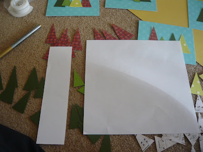
These were super simple too because they're just a bunch of squares. I cut one strip of paper off and then proceeded to snip chunks off that strip according to the different sized gift boxes I wanted. To make them look more finished I added the hand drawn bow details and the box tops, which were another small strip of paper.


A little glue stick action and wha-la!

Pre-arranging to see different combinations helps...


The Christmas Trees took all of 2.5 minutes to make too. Thats because all the cuts are straight lines. Here I am cutting the strip off my paper.
Then I cut my first angle off (and waste this one) because I dont want any Leeeeaaaaaning trees. Gotta get my angle right!
And proceed! No turning the paper, just a flick of my wrist at the opposing angle and bam, a whole pile of trees in 30 seconds!

Easiest holiday cards ever.
And they're so darn cute!

PS!!....it helps boost productivity (riiight?!) if you have some of these goodies around :)


Birthday Week Day 2- 26 years!!!!!!

Candy-Cane Lane


I cant wait to see a show here! It's such a pretty place :)


After 2 YEARS we finally rode the HOLLY JOLLY TROLLY!!!


I made it...and it cost $4.00!!!!!! Awesome :)

Couldn't decide. Course! Eventually he went with the one on the right :)